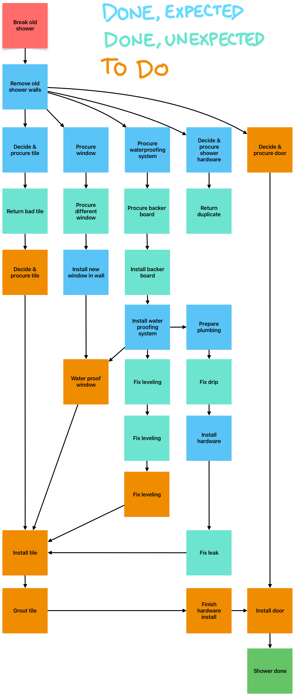
I made this graphic to show status & history of my epic two-year shower remodel project
The Graphic
As-is Analysis
The graphic is super enlightening, and brought a lot of clarity/appreciation for this massive project.
It illustrates
- Context - what started it and when it ends
- History - what’s been done
- Slowdowns - what work was unplanned
- Status - what’s next
- Forecast - what planned work remains
Future Development
This is a concept I’d really like to explore more. There are a few different aspects I could spend some time developing:
Tooling
The graphic above used the Whiteboarding App “Freeform” by Apple. It could be interesting to use Obsidian Canvases for these. It would really only make sense to use if I were using Obsidian for Projects. To handle decomposition, you’d probably need some form of modeling tool instead of purely graphical one. You’d basically be modeling units of work. Each unit of work would ideally (note: not practically) have:
- Composition - what are the steps needed to complete a task, what tasks are needed to complete a project phase, etc
- Constraints - what work must be done before what other work, what external constraints are there
- Cost - how much money was planned? How much money did it really take?
- Schedule - how much time was planned? How much time did it really take?
- Notes - essentially a record of assembly alongside a work log. The stuff you interact with while doing the work would ideally feed into the system directly. Honestly a SysML tool would work.
After playing with this concept for a couple hours, I think Notion is still the best available tool… it just lacks the arbitrary graphic capability. It also doesn’t have conditional formatting, so you’d have to just have a labeled property. Dunno. No tool does very specifically what I’m picturing.
Project Decomposition
This is showing a single, fairly high-level view. It would be neat if these elements work work could be drilled into/replaced with the actions that it took to accomplish them. I would imagine a paginated approach to this, where work tasks belonged to increasingly higher levels of activity.
Gantt
This view shows constraint flow, like an IDEF0 diagram. It doesn’t really show durations or dates like Gantt Charts do. Ideally this would show a comparison between the current state and the original plan (aka “baseline”).
Budget
It would be awesome to show the amount planned versus the amount spent.
Analysis of Alternatives
This is entering into galaxy brain territory, but you could chart an “expected baseline” for each alternative path for project completion, then use the real-world results as a basis of comparison. How did your actual project fair in comparison to the original baseline? How did it compare to the original baseline of the path not taken?
Example: Use a Contractor, or do it yourself
Comparison to EVM
EVM is a project management technique I have never really covered in these notes despite knowing a lot about it. It’s occurring to me only after having written all of the above that I’m describing a visual representation of EVM, basically. All of the Earned Value Metrics would essentially be applicable here. EV is way more rigorous than this, though.
Source
- Self