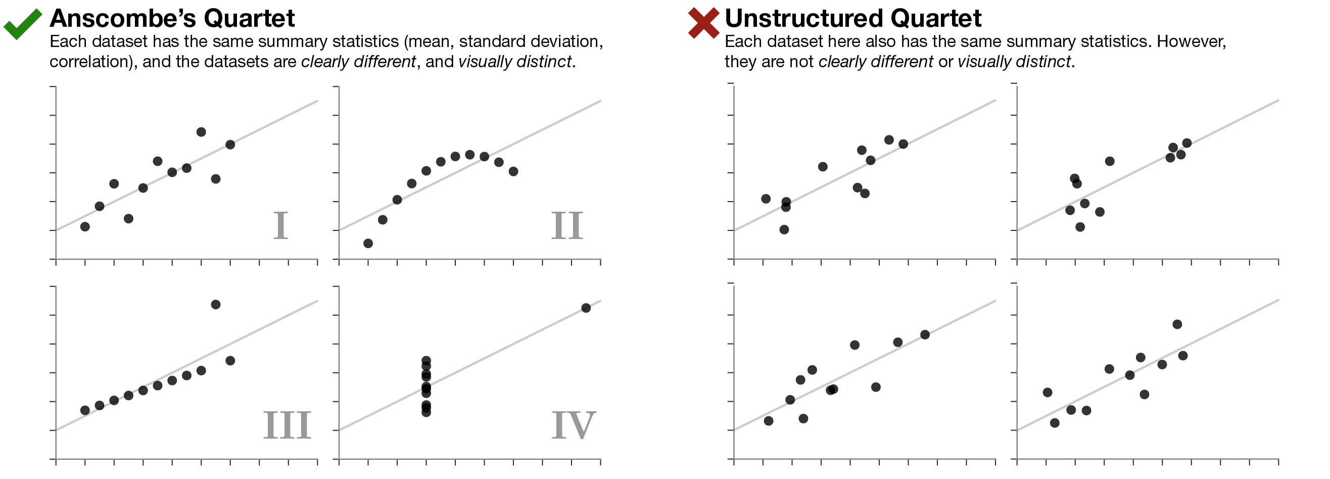
Summaries may hide truth.
There’s existed, for quite some time, a series of four charts called “Anscombe’s Quartet”. Each of these four charts have the same mean, standard deviation, and correlation coefficients. By looking at just those factors, you could wrongly assume that there are no meaningful differences in the underlying dataset. Only by plotting the data does it become clear that there’s more to the story.
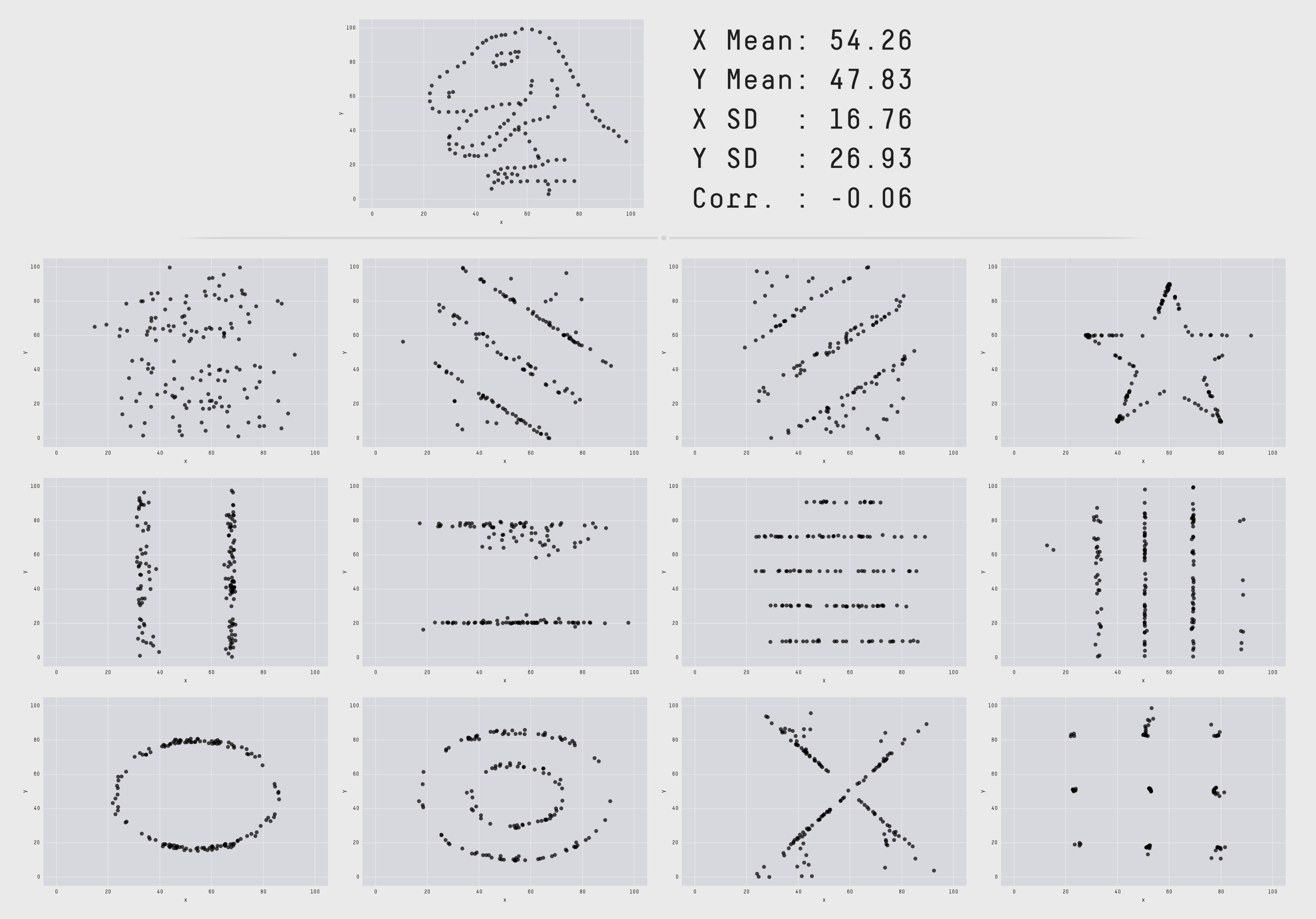
Recently, this same idea has been expanded upon by a team of researchers, who produced “The Datasaurus Dozen”. Pretty neat.
Source
https://www.autodeskresearch.com/publications/samestats